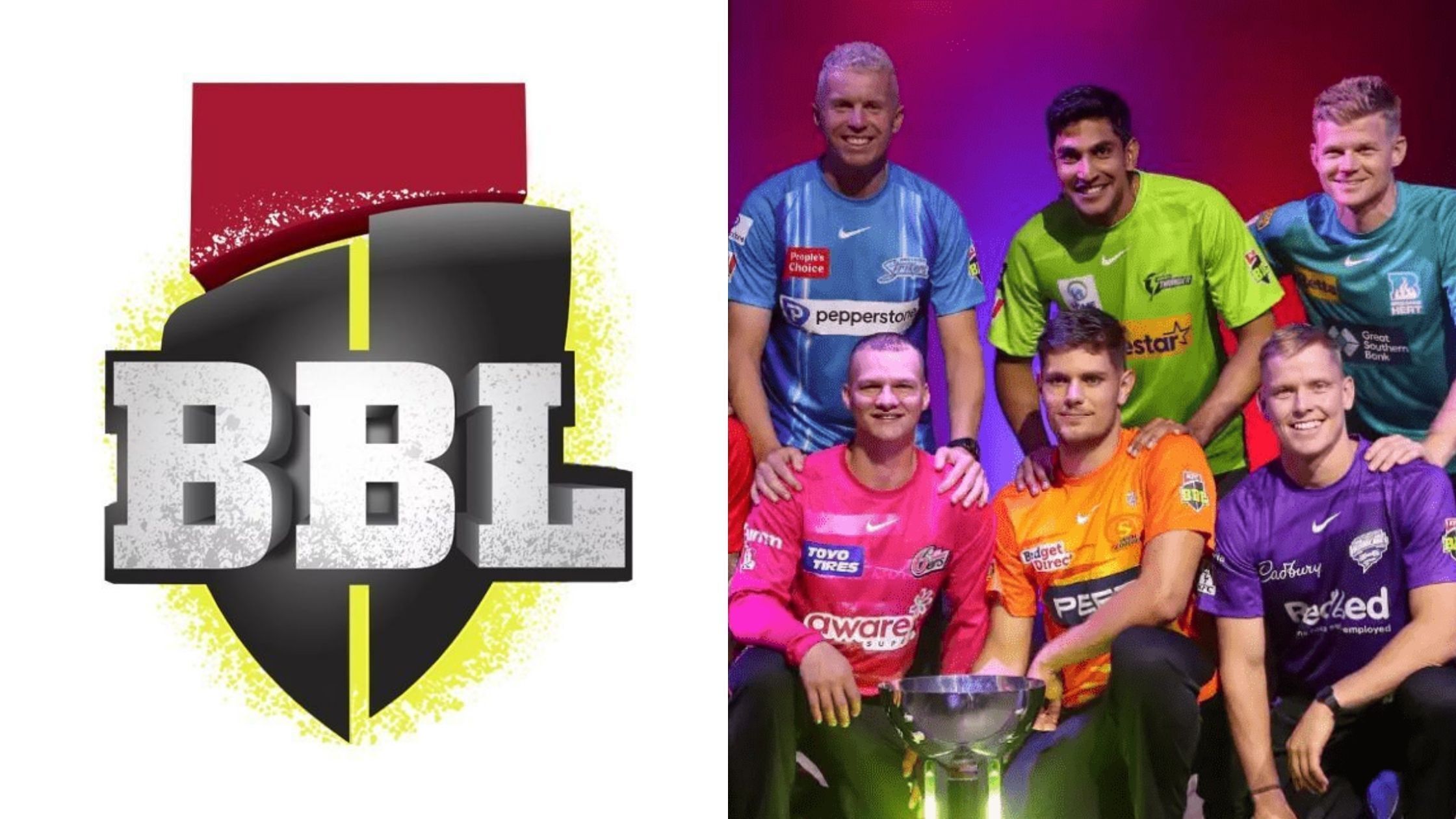
New Balance dropped fresh playing kits for Big Bash Leagues 2025-26, pulling club insignia back to center stage like the competition’s early days.
Eight clubs gathered in Melbourne to show off the new designs, which throw a spotlight on team logos instead of burying them under sponsor chaos.
Weber WBBL|11 gets first crack at wearing them when the season opens on November 9 with a triple-header split between Brisbane and Perth.
The men’s KFC BBL|15 follows on December 16, meaning Australian summer cricket gets a visual refresh right when it matters most.
Let’s take a look at each jersey and the details around the ideas.
New Balance Designs Fresh Bold Looks For Every Team This BBL 2025-26
New Balance grabbed the reins from Nike back in July, locking in a five-season partnership that starts here.
Nike dressed the league from 2021-22 through last season, but this handover brings club logos roaring back, and now they’re bigger, bolder, and impossible to miss.
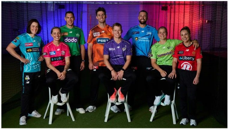
Every club keeps the black pants that became standard four years ago, maintaining that uniform look from the waist down across both competitions.
Alistair Dobson, who runs Big Bash Leagues for Cricket Australia, backed New Balance and the clubs for bringing fresh concepts to life. “We’re thrilled to provide fans with a fresh look that matches the energy and excitement of the Big Bash Leagues,” he said.
Dean Howard from New Balance Australia called the uniforms “a bold step forward” in innovation and performance, adding that the collaboration captured summer cricket’s spirit. “We’re excited for fans to experience the energy, colour, and momentum these kits bring to the game, both on and off the field.”
He added that collaborating with Cricket Australia, Big Bash clubs, and Belgravia Apparel pushed creative boundaries and delivered a look that captures the spirit of summer cricket.
New Balance has already been supplying kits for Australia’s domestic competitions, the Sheffield Shield, Men’s One-Day Cup, and Women’s National Cricket League, since 2021, so they’re not exactly strangers to cricket gear.
Watch the full video of the players wearing and opening the new kits for the first time here!
How Every Team Is Wearing Their Retro Bold Looks This BBL 2025-26 Season
Fans were called to Queensbridge Square in Southbank on October 9, from 8:00-10:00 am, to see the new kits firsthand, snap photos with players, and compete for BBL merchandise plus New Balance vouchers.
1. Adelaide Strikers
Adelaide runs pure blue this season, no gradient tricks, no pattern noise. The Strikers kept their traditional blue simple and clean, letting the enlarged white ‘S’ logo do the talking from the chest.
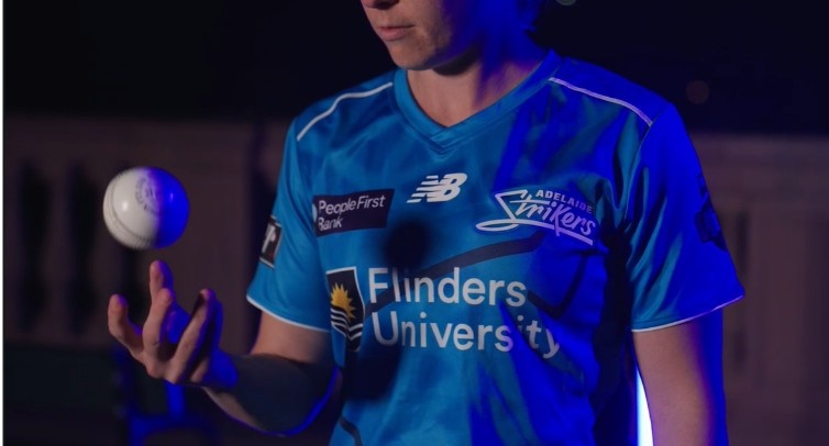
What stands out here is how much breathing room the logo gets compared to recent seasons, where it competed with busier designs. Alex Carey, the star player, chimed in on the reveal, saying a simple “Perfect, very much a Striker.”
Flinders University sits as the main sponsor across the chest, while People First Bank and Adelaide Strikers text run along the upper chests.
The kit pairs with league-standard black pants, and honestly, the whole thing feels like Adelaide remembered what made their original identity work, which is straightforward blue, big logo, and nothing complicated.
2. Brisbane Heat
Brisbane went maximum flames this year, and there’s zero subtlety about it. Bold white outlined flames slash across the teal base, showing up around the lower half of the jersey. In contrast, the entirety of the background is covered in inconsistent bands of a lighter blue.
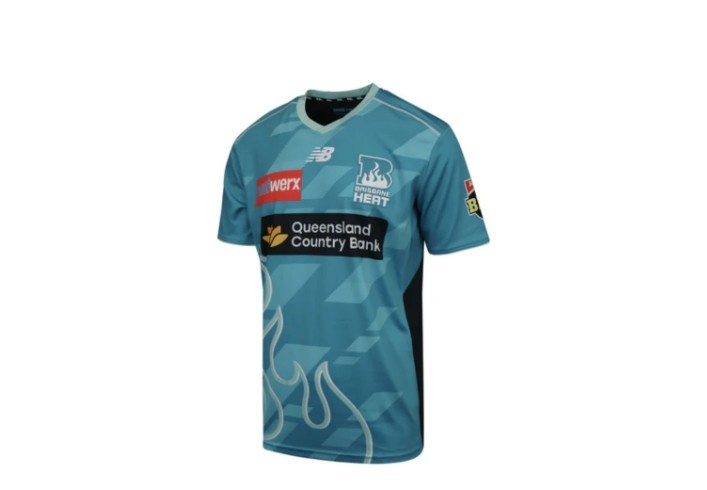
The flame pattern runs from chest to hip, creating this diagonal energy that makes the kit pop under lights. Queensland Country Bank sponsors the front as the main logo, with Werx sitting above and the Heat logo tucked into the upper chest.
It’s easily the most aggressive design in the bunch. When the Heat takes the field, you’ll spot them before anyone else. The teal-and-flame combo refuses to blend into the background.
3. Hobart Hurricanes
Hobart brought purple back correctly, and their hurricane logo now dominates the middle in silver-white, beautifully catching the light.
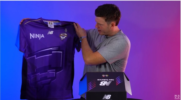
The jersey itself uses tonal purple shading and darker purple swirls that mirror the hurricane symbol work through the fabric without screaming for attention.
Even Mitch Owen commented on the new kit, saying, “looks awesome, very happy with the little championship logo and the gold stitching”.
It’s subtle enough to let the main logo shine but interesting enough that the kit doesn’t read as plain purple from a distance. NINJA appears prominently on the right upper chest, while Hobart Hurricanes text and smaller sponsor marks fill out the shoulders and sleeves.
The whole design feels balanced, with a bold logo, an atmospheric background pattern, and clean sponsor placement. Black pants anchor it all.
4. Melbourne Renegades
The Renegades brought their massive white ‘R’ back for the first time since winning BBL|08, and it absolutely dominates this red jersey.
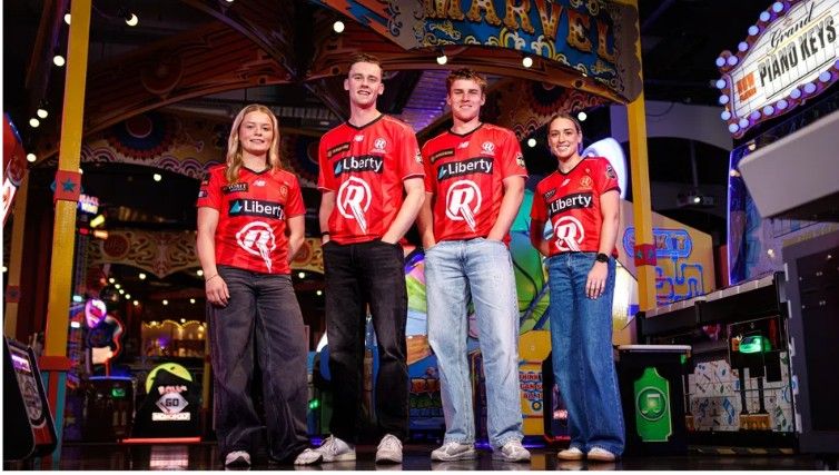
That ‘R’ stretches nearly chest-to-stomach, outlined in white against the red base, impossible to miss from anywhere in the stadium.
Liberty sponsors above it, with Tangerine running across one shoulder and the Renegades text on the other. What makes this work is the simplicity, solid red background, giant team symbol, and minimal pattern interference.
The ‘R’ gets all the attention it deserves, which is clearly what Melbourne wanted after years of more complicated designs. Black pants complete the look, keeping focus on that striking red-and-white top half.
5. Melbourne Stars
Melbourne’s five-point star sits bold and white against its traditional green base, scaled up to command the lower half of the jersey properly.
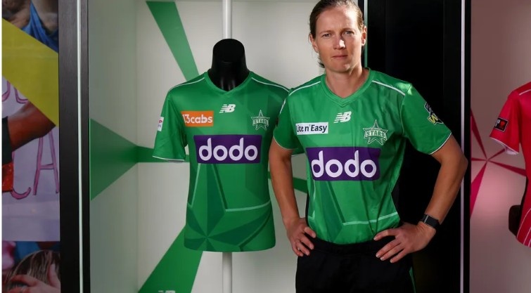
The jersey uses tonal green shading throughout, with darker green geometric patterns that add without cluttering the design. It’s smart layering that gives the kit texture while keeping the star as the focal point.
DODO sponsors across the middle, with Melbourne Stars text running the shoulders and the star logo itself positioned prominently.
What separates this from previous Stars kits is how clean the hierarchy reads: star first, everything else second. The green remains their signature color, but the execution feels sharper this season.
6. Perth Scorchers
Perth delivered something different, where their jersey tells a story about Western Australia through design layers. Up close, you catch topographic line patterns meant to mirror WA’s red dirt terrain, these subtle contour-style graphics that texture the orange base.
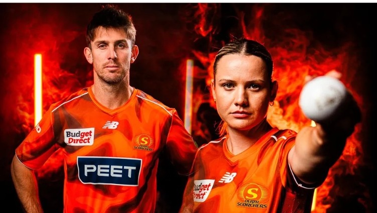
Step back, and those same patterns read as flames licking up the jersey, perfectly capturing the Scorchers’ fiery identity. PEET sponsors front and center, with the Scorchers logo smaller but positioned above.
The orange base shifts between lighter and darker shades as the “flames” build, creating movement across the fabric. It’s the most conceptual kit in the lineup, as Perth called it “baptism of fire” for a reason.
Alana King from the women’s team said the design reminds her almost of a “Dry Terraine”. Conceptual indeed.
7. Sydney Sixers
Sydney Sixers kept their magenta signature but supersized the ‘6’ to remind everyone who won three of the last five championships. The magenta colour is framed by two black bands running down the sides, right under the arms.
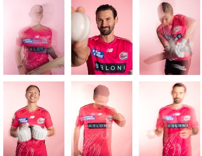
The jersey uses solid magenta, no patterns fighting for attention, just clean color that lets the number dominate. TBELONG sponsors above the ‘6’, with smaller “Sydney Sixers” branding on the left upper chest.
What works here is that magenta has always been their color, and enlarging their iconic ‘6’ symbol just makes that identity louder. The design doesn’t try to reinvent anything, but just amplifies what already worked.
8. Sydney Thunder
Sydney Thunder drew inspiration straight from Western Sydney streets for this kit, launching their campaign across train stations, parks, and the neighborhoods they represent.
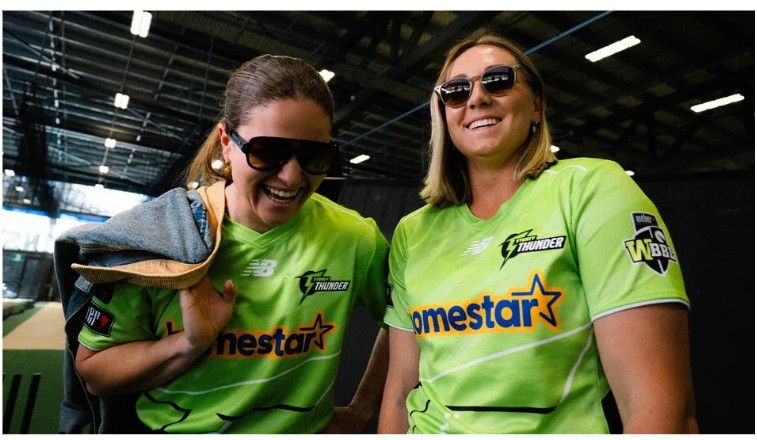
The jersey rocks their electric lime-green base with a massive black lightning ‘T’ slashing diagonally across the lower half. That ‘T’ creates serious visual movement, as it’s not static, and looks like it’s actually striking through the jersey.
Homestar sponsors on the front, and Thunder text fills out the rest. The lime-green-and-black contrast is sharp enough to hurt your eyes in the best way possible.
It’s street style meeting cricket, which apparently is exactly what Western Sydney looks like. Black pants keep the league-wide consistency, while the top half screams Thunder.
Fans Love The New Kits For BBL 2025-26
Fans split on the new kits exactly how you’d expect. Some are here for the throwback energy, while others want something entirely different.
Social media lit up with reactions once the designs dropped, and the responses ranged from nostalgic approval to flat-out disappointment.
“BBL jerseys are slowly becoming iconic, maintaining colours from the first season” – Reddit
“NB is incredibly good at making kits. When they were the kit sponsors for Liverpool, we had some of our best kits of the modern era.” – Reddit.
“Finally, I really didn’t like those old faded/speckled ones” – Reddit
“They are all pretty crap tbh, it’s always the team logo plastered onto a t-shirt” – Instagram
The reaction basically confirms what always happens with kit launches. Nostalgia wins some people over, while innovation skeptics stay skeptical.
New Balance played it safe by going bold with logos instead of experimenting with radical new designs. Depending on who you ask, that’s either exactly what BBL needed or a missed opportunity.
Related Read:
Conclusion: BBL 2025-26 New Kits Are A Call Back To Older Seasons, Being Retro But Still Bold
New Balance made their choice clear, bringing club identity back to the front, literally. The enlarged logos across all eight teams reverse the trend of shrinking team symbols in favor of sponsor real estate.
Some fans see that as bold, others think it’s just reverting to what already worked a decade ago instead of pushing boundaries. Either way, these kits look different from the Nike era, and that’s the point.
Whether you’re buying a jersey or just watching from home, team logos are impossible to miss now, which is probably what Big Bash wanted when they signed New Balance.
The kits will be on the field when WBBL|11 starts in November, and the conversation around them isn’t wrapping up anytime soon.
FAQs
New Balance designed them, working with Cricket Australia, the eight clubs, and Belgravia Apparel, after replacing Nike starting this season on a five-year deal.
The kits are available through official BBL club stores, Cricket Australia’s shop, and authorized retailers across Australia as both performance and supporter versions.
The men’s KFC BBL|15 starts December 16, 2025, with Hobart Hurricanes hosting the opening match. The season runs through the Australian summer.
Weber WBBL|11 kicks off November 9, 2025, with a triple-header across Brisbane and Perth, before the men’s competition begins in December.
Hobart Hurricanes claimed their first-ever Big Bash League title in BBL|14, defeating Sydney Thunder in the final to end their championship drought.
